Branding
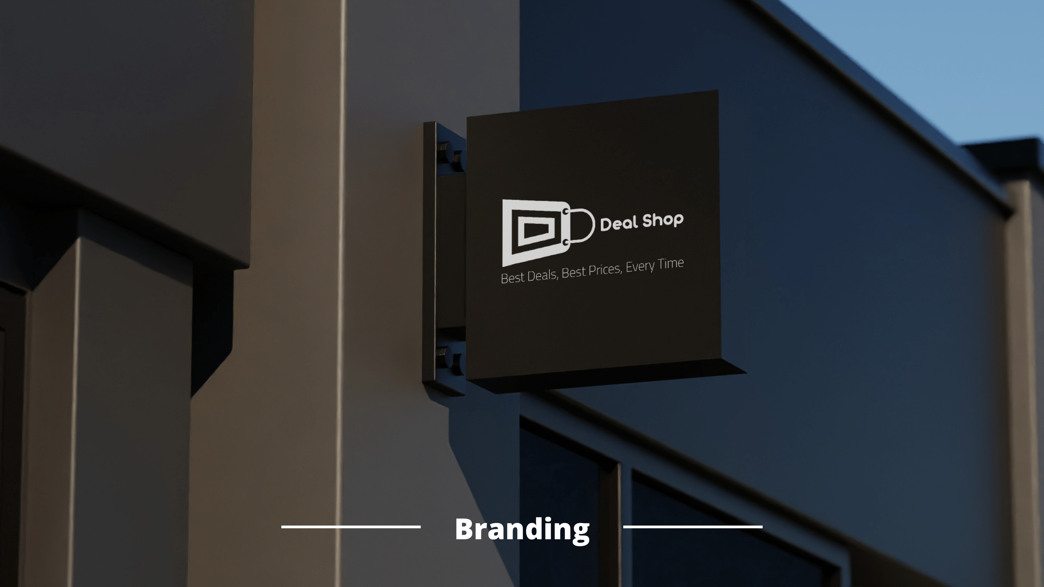
Deal Shop
To create a distinctive and memorable logo and brand identity for Deal Shop, an online platform offering unbeatable deals and best prices on various products. The goal was to design a logo that symbolizes the convenience and efficiency of online shopping while highlighting the company’s commitment to customer satisfaction.

Target
Deal Shop faced several challenges in establishing a cohesive and impactful brand identity for their e-commerce platform:
- The need for a distinctive logo that effectively represents the brand’s values and mission in a competitive online retail market.
- Difficulty in creating a visual identity that balances simplicity, efficiency, and modernity to attract a broad customer base.
- Limited time and resources to craft a memorable design that enhances brand recognition and trust among new and existing customers.
Solutions
1. Logo Concept
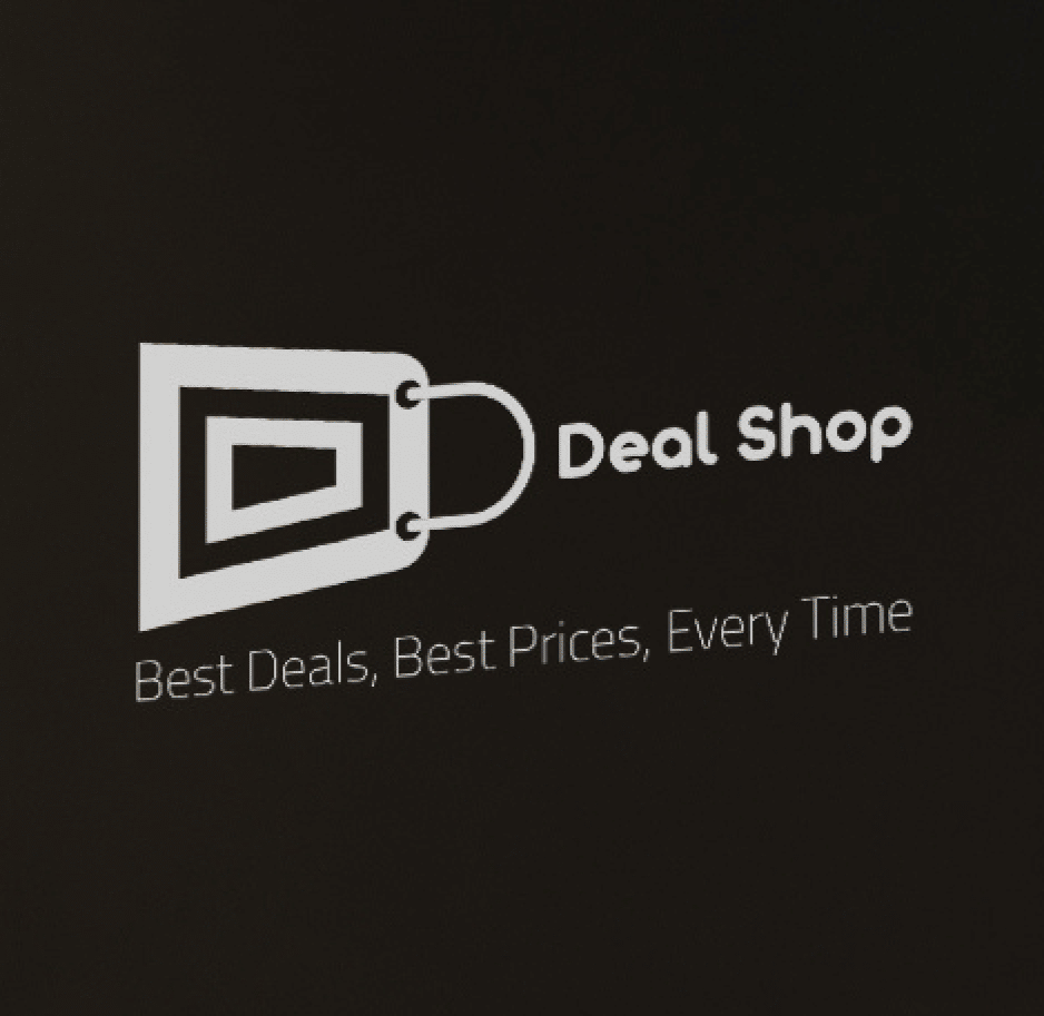
The Deal Shop logo integrates a stylized shopping cart with the letter “D,” creating a unique and visually appealing symbol. This design effectively encapsulates the essence of Deal Shop’s values and services:
- Shopping Cart: Represents the shopping journey, a variety of products, and the convenience of online retail.
- Letter “D”: Symbolizes “Deal” and “Deal Shop,” reinforcing brand identity and recognition.
The interplay of these elements creates a cohesive and meaningful design that conveys trust, simplicity, and a focus on value.
2. Color Palette
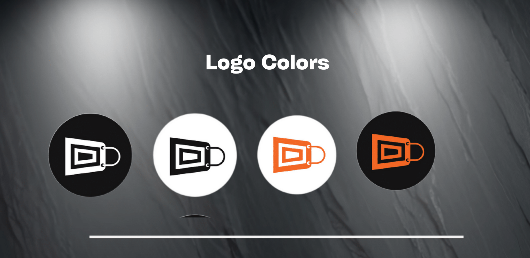
The color palette was chosen to evoke professionalism, trust, and energy:
- Black: Signifies strength and sophistication.
- White: Reflects clarity and simplicity.
- Orange: Adds energy, enthusiasm, and a sense of urgency to seize deals.
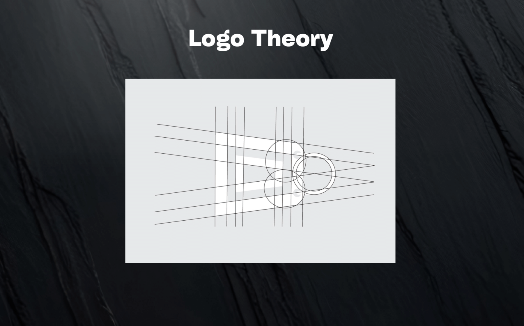
3. Logo Theory
The logo’s design follows geometric principles to maintain balance and harmony. The proportions of the shopping cart and “D” element align perfectly, creating a polished and professional appearance. Circular elements emphasize inclusiveness and customer-centricity, while the angular lines symbolize structure and efficiency.
Design Outcomes
- Dynamic Logo Variants: Designed multiple versions of the logo for different backgrounds and branding contexts.
- Memorable Brand Identity: Delivered a versatile branding package adaptable to website, social media, and promotional materials.
- Customer Appeal: Ensured the logo resonates with Deal Shop’s target audience, fostering brand loyalty and recognition.
This project demonstrates XONDER’s expertise in crafting distinctive and memorable brand identities that effectively communicate the essence of the business, resonating with target audiences and enhancing market presence.

We use cookies to give you the best experience. Cookie Policy

